Get in touch
TAKANEO - Creative Communication Agency in Luxembourg
ADDRESS
3 rue de Steinfort – L-8476 Eischen
EMAIL
info@takaneo.com

The project at a glance
Art & Care is a project led by the King Baudouin Foundation.
Its ambition is simple and essential. It serves as a reminder that art, culture, and heritage are not luxuries. They are powerful levers for well-being and social connection. Originally, the program targeted seniors. Today, it is opening up to an intergenerational approach, with the human being at the center.
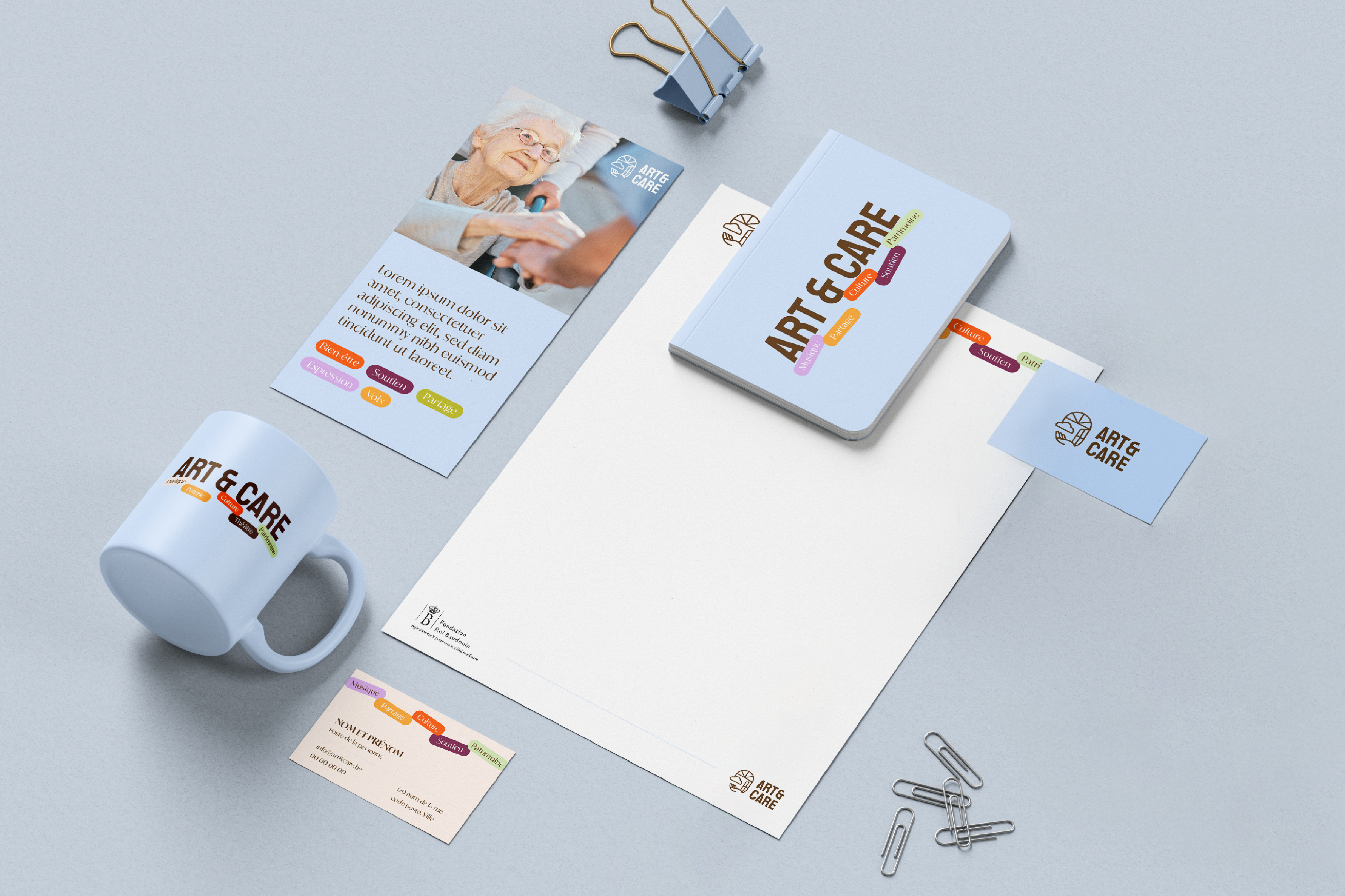
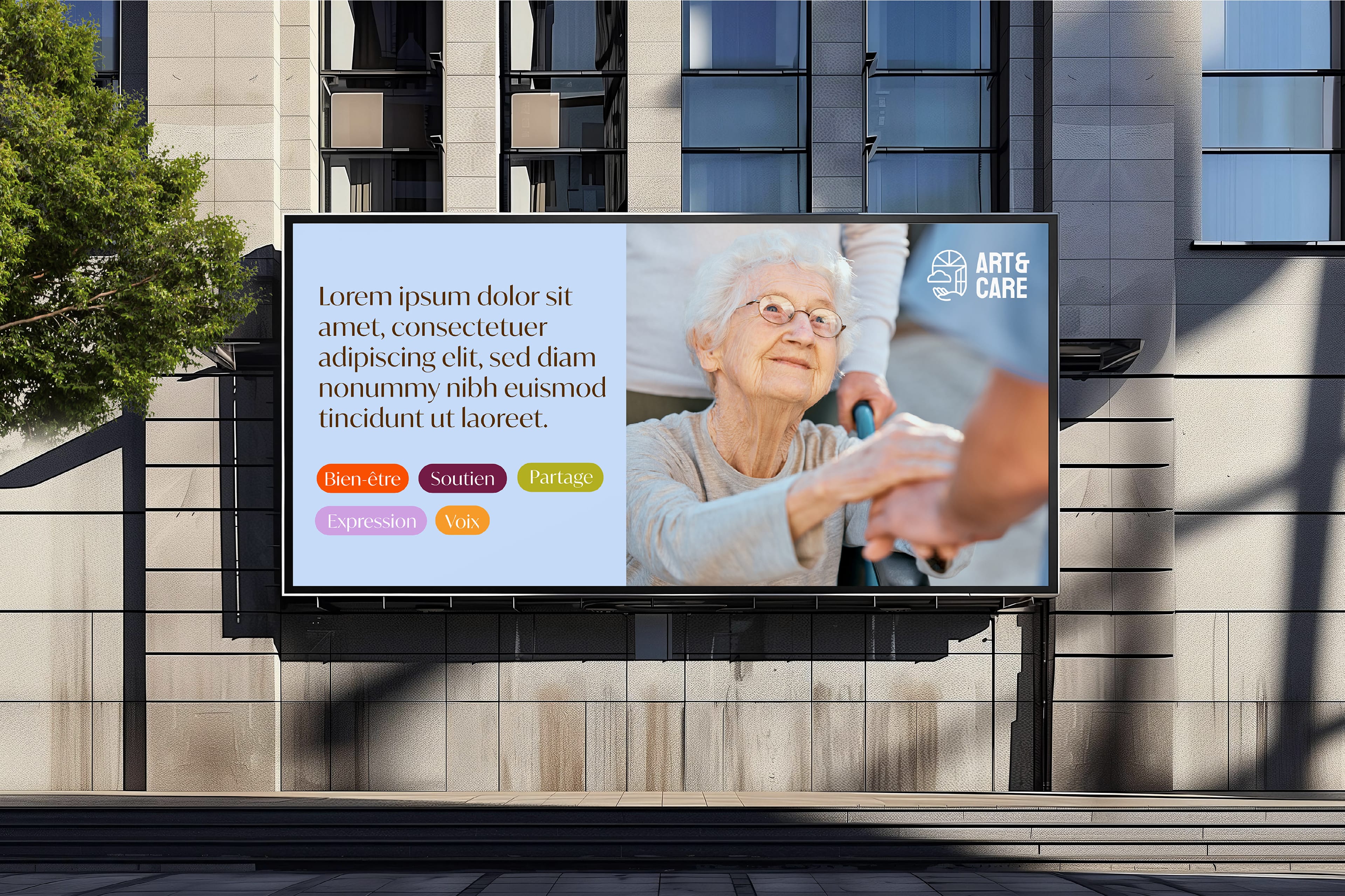
Takaneo was commissioned to design the project’s visual identity. It also structured its graphic creation for greater consistency and impact.
Design of an inclusive, legible logo adaptable for print and digital
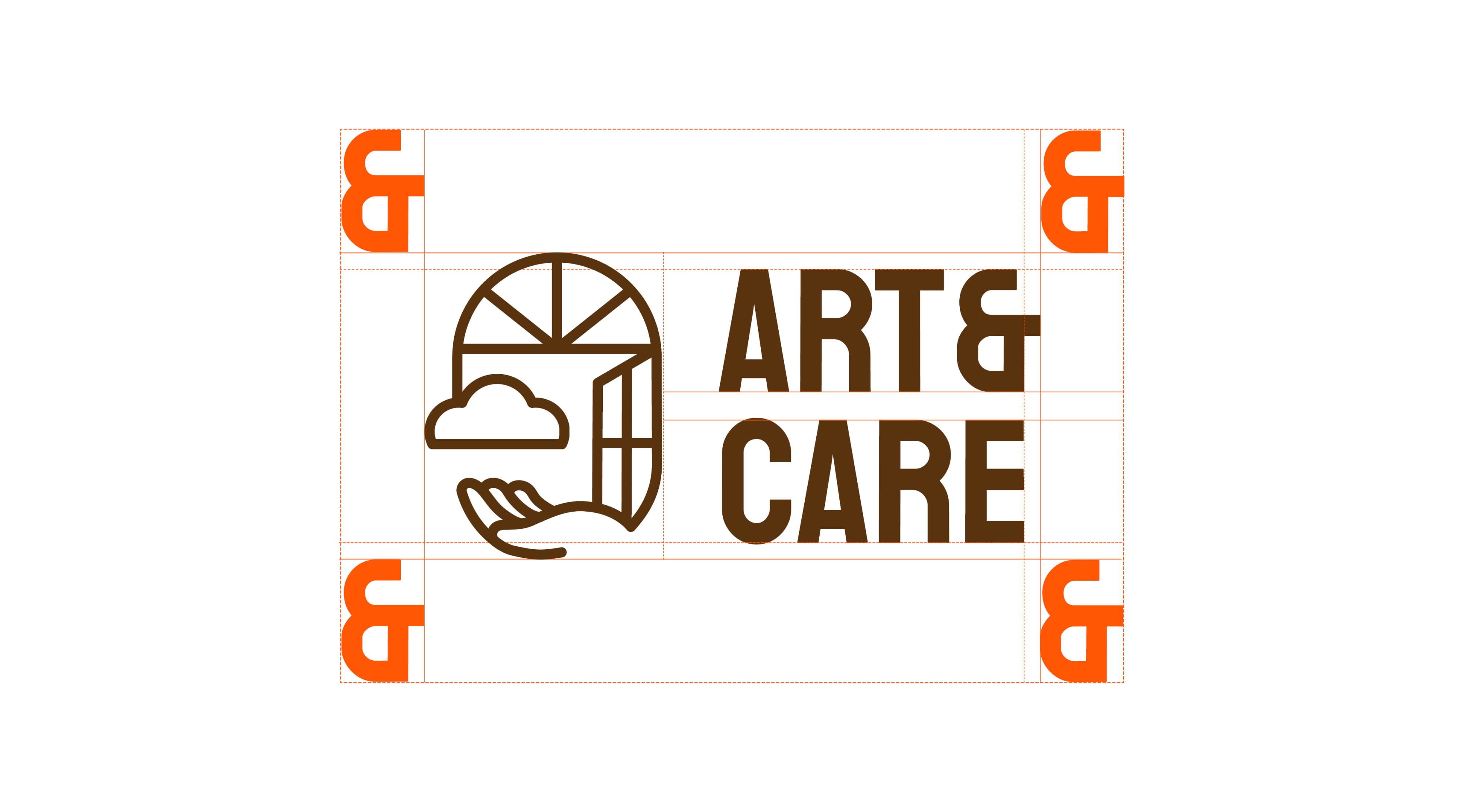
The challenge was delicate: to create a figurative logo that was immediately understandable, warm, and inclusive. This logo creation had to evoke art in all its forms without falling into medical connotations. To speak of care without hospital codes. To speak of culture without elitism. And to guarantee perfect legibility, in both print and digital, alongside the King Baudouin Foundation logo.
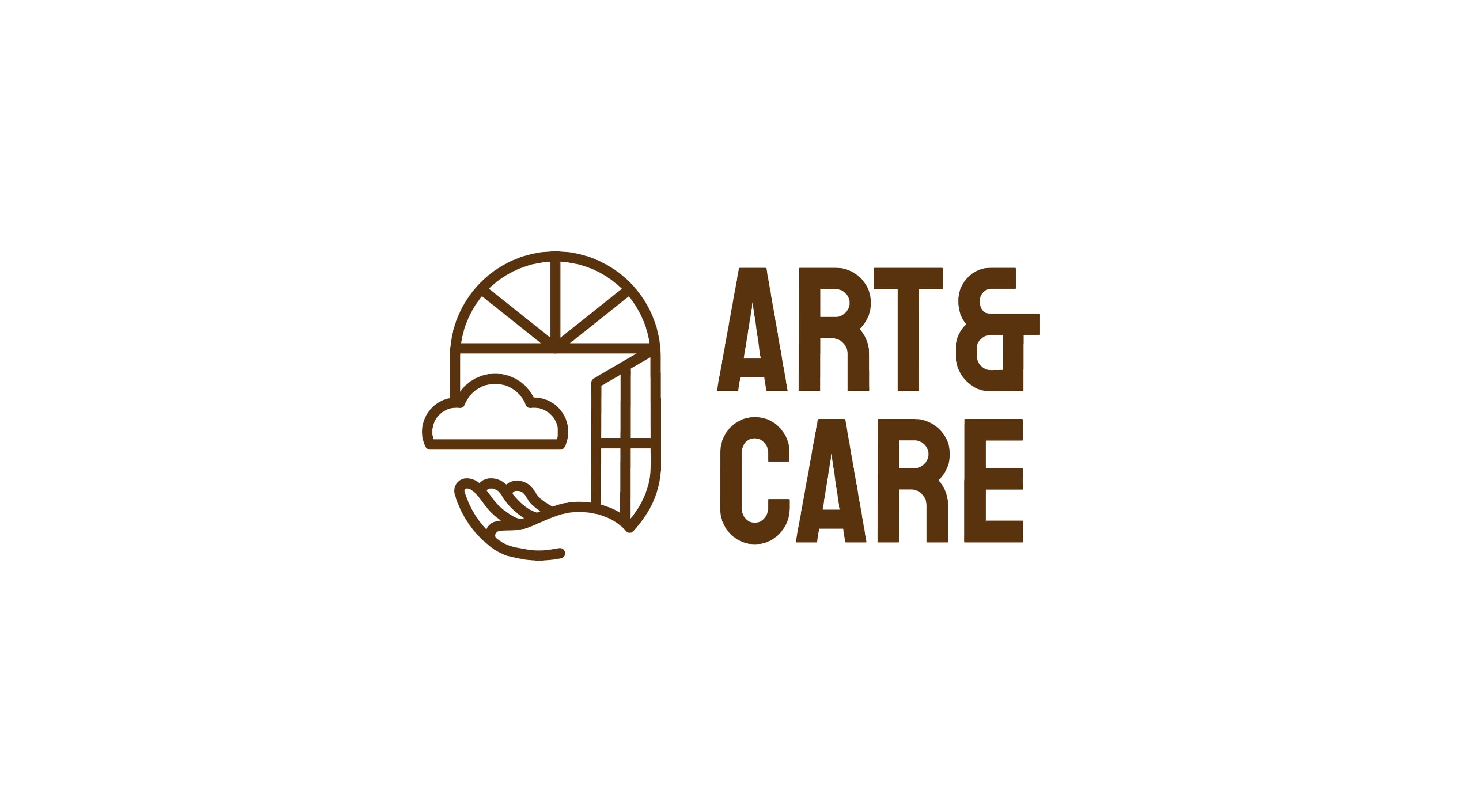
A graphic identity based on the symbolism of an open window
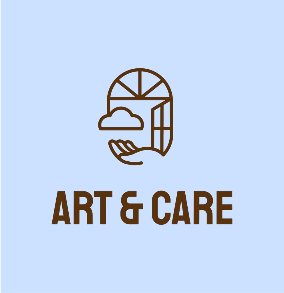
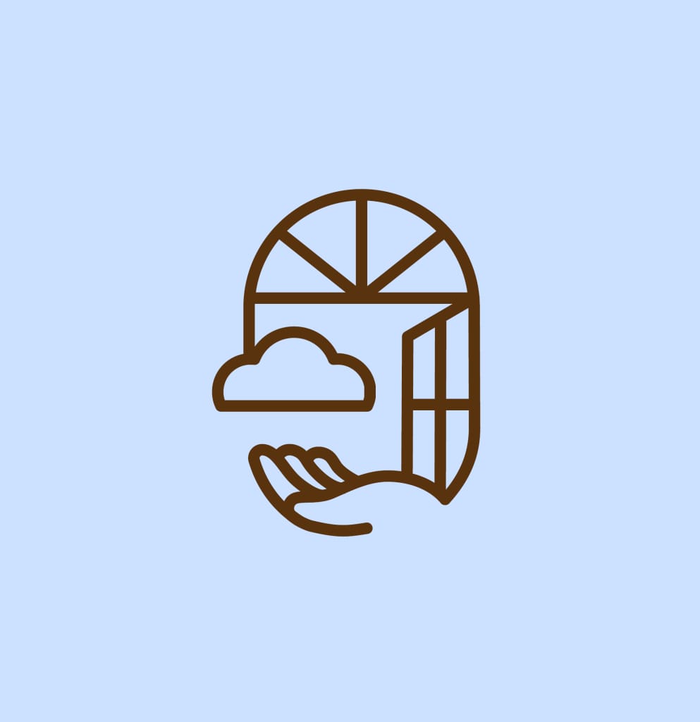
We imagined an identity built around a central symbol: an open window. The window becomes the sensitive space where art, dreams, and care meet. Its rounded shapes suggest softness and welcome. It is not a border; it is an opening. This approach is part of an institutional branding process, where each visual element carries meaning and reinforces the project’s legibility.
Art direction and visual storytelling inspired by art and creativity
A cloud escapes from it, like a thought in motion—a poetic breath that invites contemplation and creativity. An image that echoes the world of Magritte, where windows open the mind as much as the gaze.
A logo embodying care, support, and human attention
A hand accompanies the whole. It embodies care, support, and the attention given to others. It is a universal gesture, understood in all cultures—a sign of presence and protection. In the context of support, it evokes both human contact and emotional gesture. Graphically, it softens the geometry of the window and brings fluidity and harmony.
Martine Cardinael, Project & Knowledge Manager at the King Baudouin Foundation, explains:
“The creation of a visual identity for our activities surrounding the theme of art and the elderly is an essential element for the dissemination and affirmation of the project’s identity. Takaneo was able to transform our ideas, which were sometimes abstract, regarding the impact of art and culture on the health of elderly and aging people into a concrete concept. The agency thus developed a unique and recognizable logo, while ensuring its harmonious integration into the broader visual identity of the King Baudouin Foundation and its Health program. The different variations of the logo offer great flexibility of use and guarantee its longevity. “
A sustainable graphic identity for a project with social impact
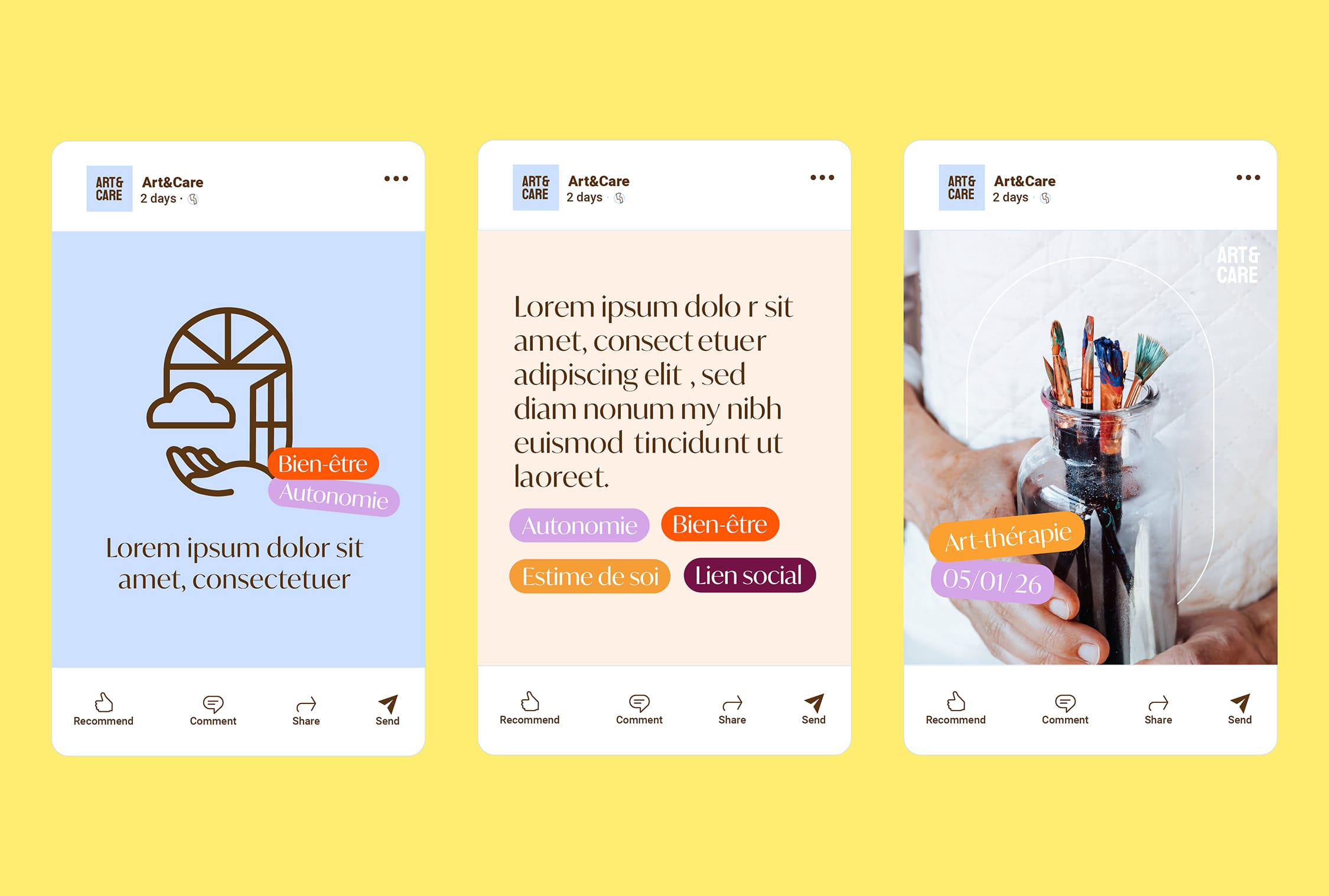
Beyond the logo, we built a coherent graphic universe. It can evolve over time and brings together various partners around a single message.
Art & Care now has a strong and embodied identity. An identity that does not just talk about support; it shows it.