Get in touch
TAKANEO - Creative Communication Agency in Luxembourg
ADDRESS
3 rue de Steinfort – L-8476 Eischen
EMAIL
info@takaneo.com
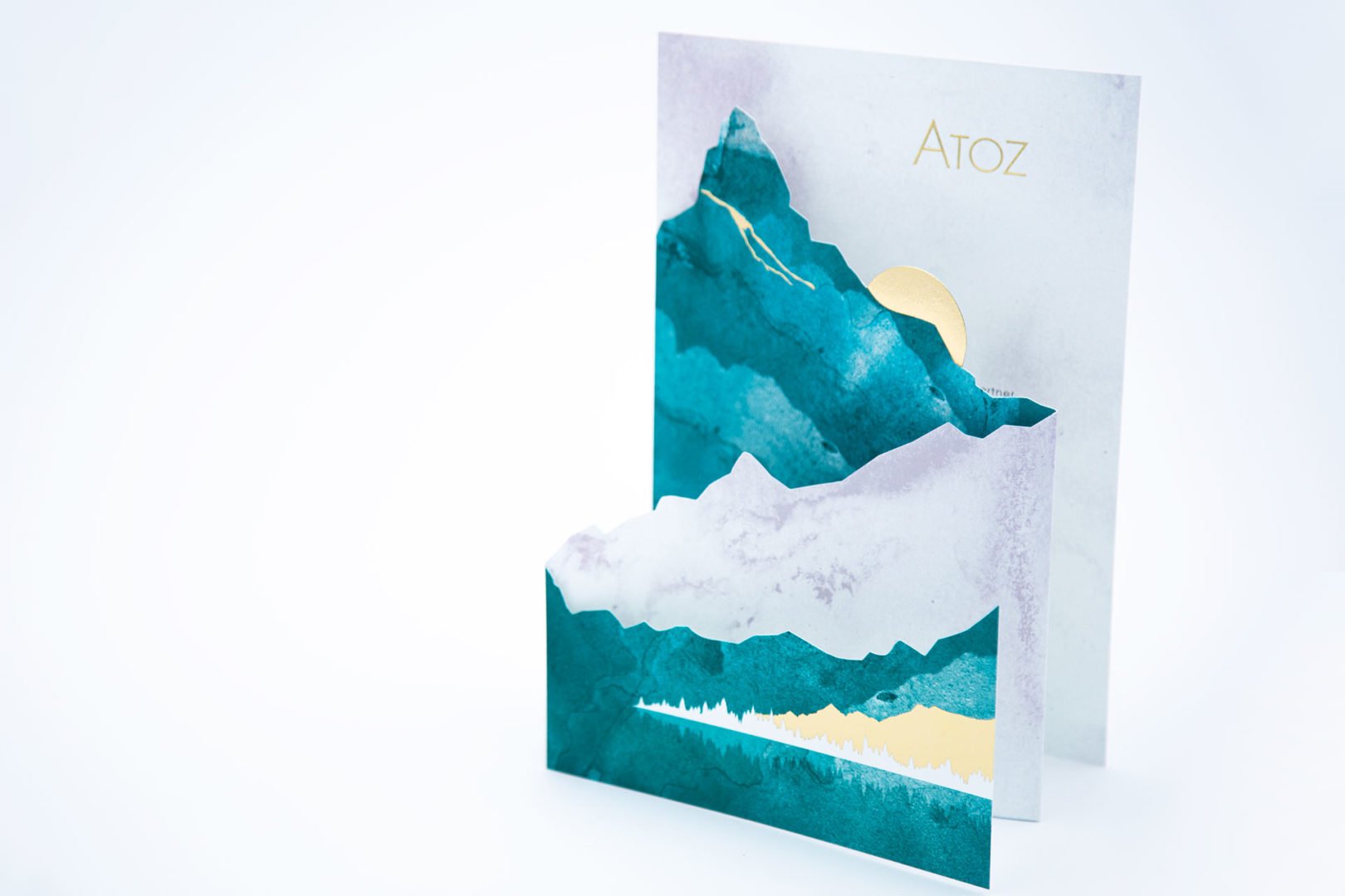
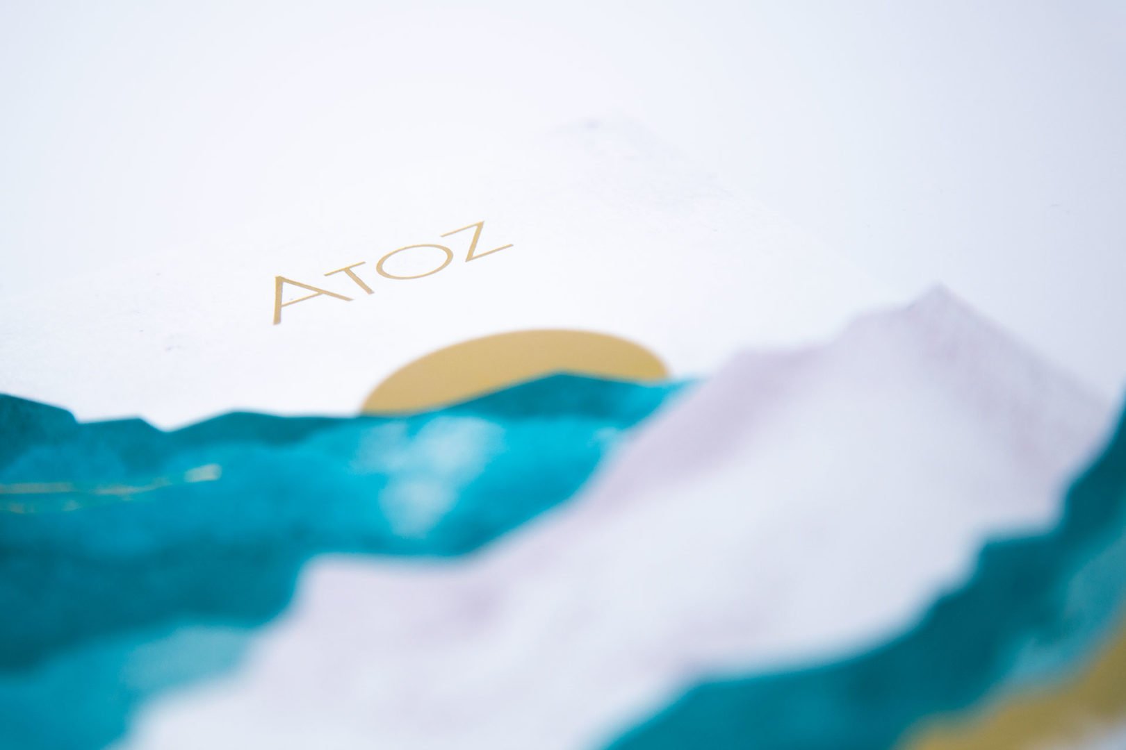
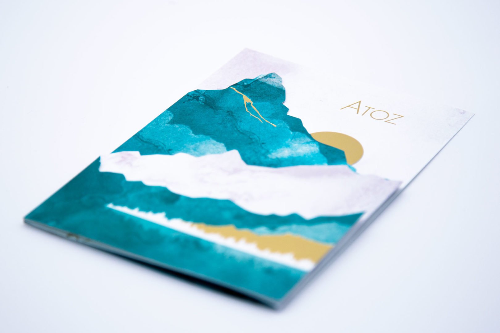
During ATOZ's rebranding in 2018, Takaneo had selected landscape images and vast expanses to define the brand's visual identity. When ATOZ commissioned Takaneo for its 2020 greeting card, the goal was to propose a visual concept consistent with the existing graphic universe.
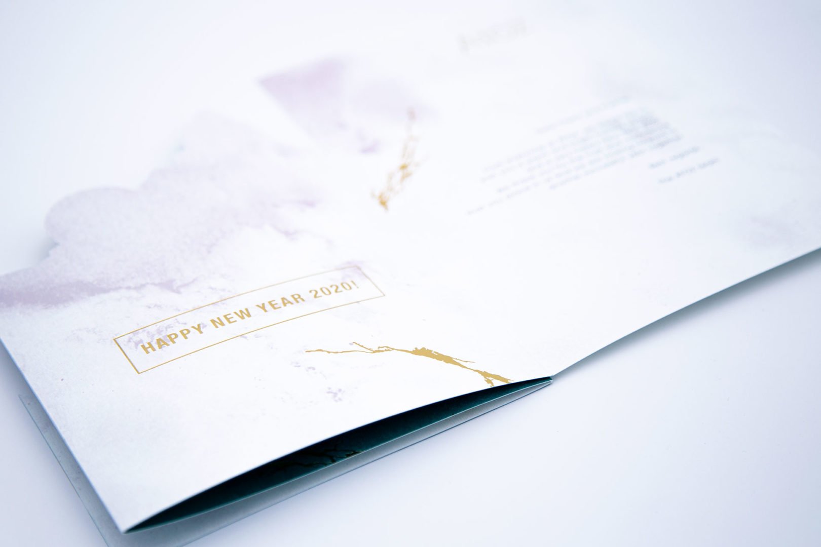
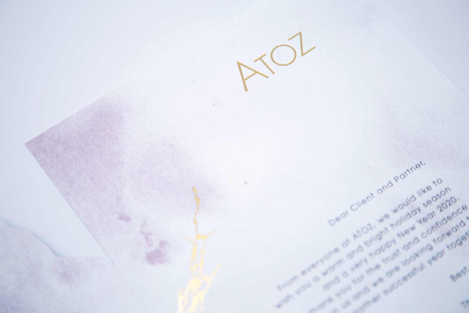
The agency drew inspiration from mountains for the greeting card's design, which was finalised as a four-panel accordion fold. Various cut-outs illustrate a landscape textured with organic and mineral materials such as quartz and emerald. Hot foil stamping adds a chic and festive touch for the end-of-year celebrations.
The agency's tasks included proposing creative concepts, advising on finishes and printing techniques, graphic design and technical preparation for printing.